
Moonstruck
Chocolate Co.
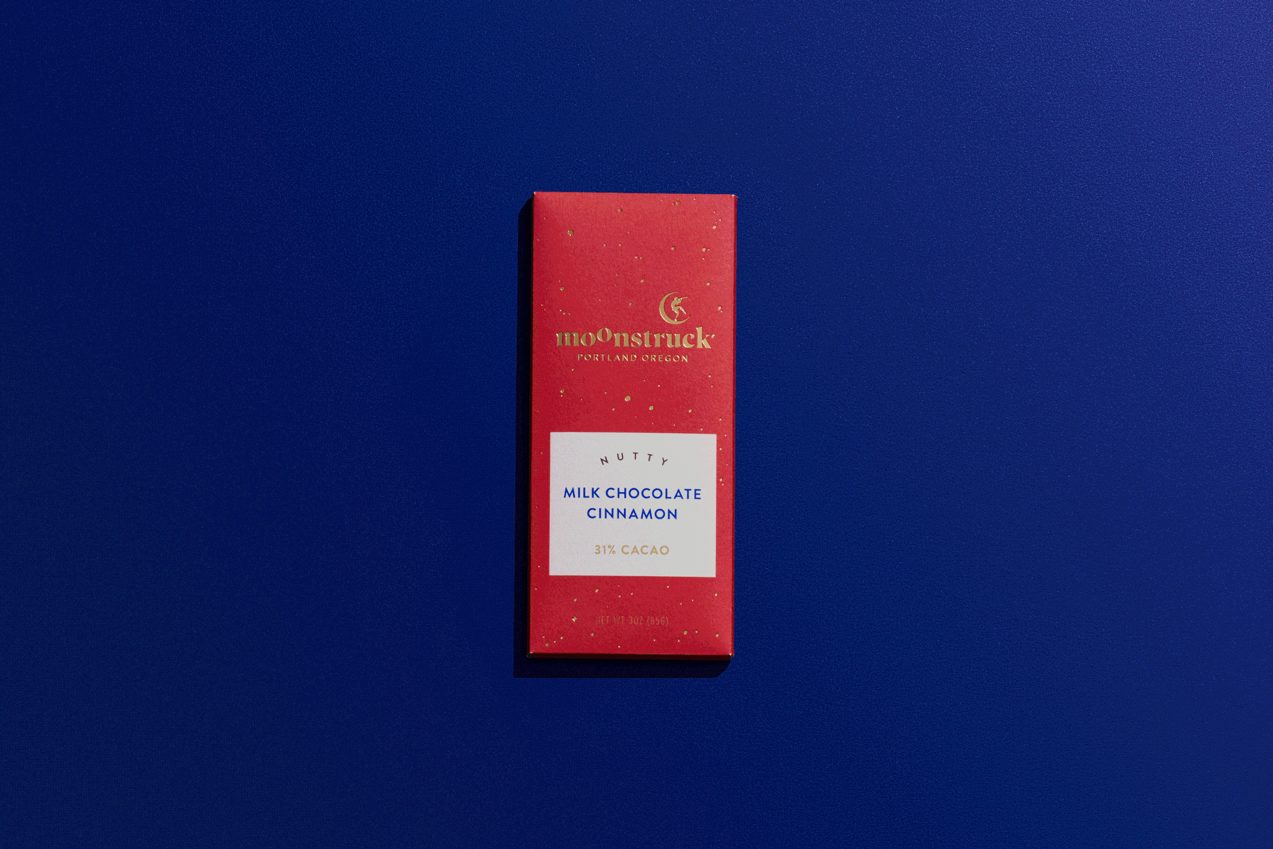
Moonstruck Chocolate Co. came to Sockeye seeking a packaging redesign of their classic bar offerings, while looking to expand distribution nationally. Once a leader and innovator (started in 1993), the brand was overpowered by a category that wildly expanded through competition, product innovation, bold flavors, flashy packaging and more. Our National consumer research revealed an important insight: the magic of chocolate disrupts the monotony of adulthood. In a category where more is more, we strengthened Moonstruck’s position by leaning into something only they possessed… a name that is powerfully emotional as being “moonstuck” means to be dreamily romantic or bemused. As we celebrated the dreaminess of their name, we embraced the belief that chocolate is a gift you give yourself.


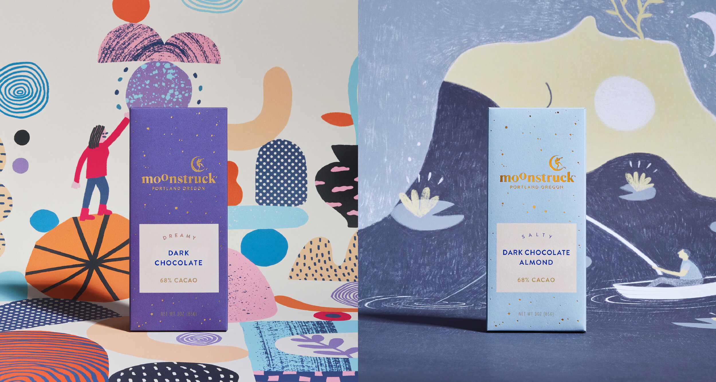


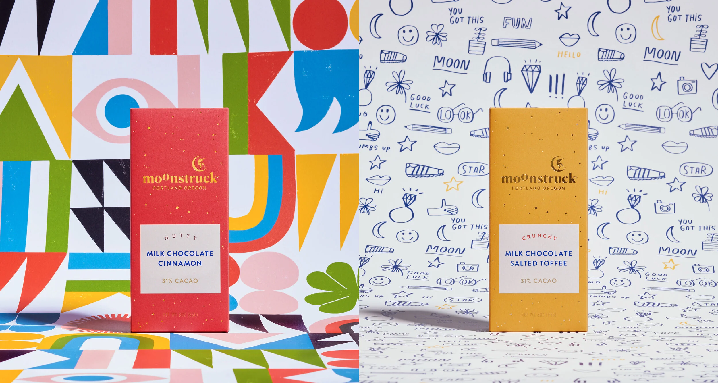

Working with local artists, the new identity and packaging celebrates the ritual that takes place from purchasing to unwrapping to the chocolate itself – because where there is chocolate, there is magic.


Shout-outs
My role included: Art and Creative Direction, design and copywriting while at Sockeye. Design and production collaboration with the ever talented Maddie Black. Strategy and copywriting by Emily Smith. Yen Nguyen’s management skills make the world go round.
Special thanks to our illustrators: Lisa Congdon, Brett Stenson, Lan Truong, Tess Rubenstein, Kate Bingaman-Burt, and Ryan Bubnis – y’all are magic!
Photoshoot Details
Photographer: Polara Studios
Stylist: Anne Parker
PIC: Maddie Black
Producer: Hari Khalsa
Bar & Background printing: Brown Printing